Published on to joshleeb's blog
In the last post, we investigated the process of shaping ligatures for monospace fonts. This ended up being quite surprising if also fairly straightforward.
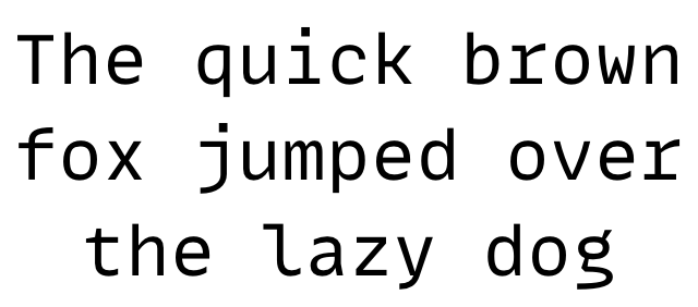
The font I used in that post was MonoLisa, designed by Marcus Sterz. I have been using this font as my daily driver for a while (since 2021) so it was a real pleasure when I found myself talking to Marcus a few weeks ago.
In what was a very interesting chat, we talked about many aspects of font design and the design for MonoLisa specifically. Marcus was also able to provide some insights into the ligature shaping behavior I had observed.
The Design of MonoLisa
Marcus started designing typefaces 14 years ago but MonoLisa was his first monospace font designed for a specific purpose: code.
This project started soon after meeting his now teammates Juho Vepsäläinen and Andrey Okonetchnikov in his co-working space in Vienna. The three discussed monospace fonts, finding potential to contribute to what was out there at the time. With Marcus designing the font, Juho and Andrey would work on the marketing and the website.
In our chat, Marcus explained that typically monospace fonts are created by adjusting proportional fonts to fit the additional uniform spacing constraints. But this isn’t how he wanted to design MonoLisa. Instead, he wanted the font to be designed monospace-first, with the primary use-case being code in editors and developer tooling.
Marcus started noticing in the context of these technical environments, there was a sense of geometric rigidity and spartan design. These are, after all, engineering tools designed for engineering tasks and thought. He saw that this design philosophy also extended to the fonts, citing JetBrains Mono as an example of a geometric font that feels designed by formula rather than by feel.
Now there’s nothing wrong with a font that is geometric and formulaic, especially for coding, but Marcus wanted his design to be softer, more organic, and more human to provide some relief.

The contrast of the more organic MonoLisa in a less organic coding environment is not something I was previously aware of before this discussion, though I suspect it was part of what drew me to this font. Personally, I love the geometric shapes and rigid lines of developer tooling and mixing that with the softer feel of MonoLisa is something I’ve found oddly satisfying.
Given the specific coding use case, the font also had to be designed with functionality as priority; Marcus didn’t want to design a font just to look cool. Function and quality had to come above all other design aspects.
In considering these motivations, I asked him if there were any fonts that stood out as inspirations for the design of MonoLisa. Marcus immediately referred to the Humanist Typefaces, particularly Frutiger, and further mentioned Operator Mono as another source of inspiration.
Handling Ligatures
As a quick recap of Shaping Ligatures in Monospace Fonts, we observed that ligature glyphs are sometimes followed by one or more spacing glyphs. The conclusion we postulated was that this is a workaround for glyphs whose width exceeds the font’s uniform advance required of a monospace font.
Marcus confirmed this was the case but also that it isn’t a standard convention for monospace fonts.
He also explained that it was only initially that the spacers came after the ligature glyph. After the team discovered issues with a few editors, Marcus took a look a Fira Code, another popular monospace Font with ligature support, and saw that the spacing came before the ligature. When the same was implemented for MonoLisa, these issues were fixed.
Controlling when and where these spacers appear is handled by a script written by Rainer Scheichelbauer, one of the makers of the Glyphs font editor.
What’s Coming Next
The team continues to work on MonoLisa with updates published every 2-4 months and they meet at least every two weeks to discuss improvements with many coming from Github discussions.
Marcus also shared with me that they have been working on something really exciting. I can’t share exactly what it is but, as a hint, it has something to do with… proportions.
To finish up, I really want to thank Marcus for taking the time to have such a engaging chat with me and for answering my barrage of questions. I also want to thank Juho for reaching out following my previous post. I never thought that writing on this blog would open up an opportunity like this. Really excited to see the next steps for MonoLisa and the team.