Published on to joshleeb's blog
For some time I’ve been working towards building a graphical code editor from scratch. I’m still in the explorative phase of this project which involves creating many small, conceptual pieces to better understand the various problem spaces. The problem space I’m working through at the moment is text rendering, with the current focus being shaping.
Shaping is the process of converting text (UTF-8 code points in our case) to a sequence of glyphs with positional information to be rendered. It can get very complex and computationally expensive. For more info take a look at the HarfBuzz Manual.
You might think shaping for a code editor with a monospace font should be trivial (hint: nothing with text rendering is trivial). The text is almost all English with glyphs from the Basic Latin Unicode block. That means there are rarely diacritics or other complex font structures. So we should be able to match every code point to a single glyph, and each glyph has the same width as we’re working with a monospace font.
With these simplifications you can go a long way with text rendering for a basic code editor, that is, until you want to handle emojis (which also relies on a font fallback subsystem) or ligatures.
Inspecting the Glyphs
For this post, we’ll be using the swash crate to provide us with a shaping algorithm. We’ll also be using the monospace font MonoLisa which has ligature support, though similar behavior has also been observed with Fira Code.
Now, let’s try shaping some ligatures and inspect the sequence of glyphs we get back.
for cluster in shape("#{Q}", Ligatures::Enabled) {
    for glyph in cluster.glyphs {
        println!("id: {}, name: {}", glyph.id, glyph.name);
    }
}

// id: 0763, name: "numbersign_braceleft.liga"
// id: 1252, name: "LIGSPACE"
// id: 0129, name: "Q"
// id: 0705, name: "braceright"
And we’ll compare this to the output when ligatures are disabled.
for cluster in shape("#{Q}", Ligatures::Disabled) { ... }

// id: 0694, name: “numbersign”
// id: 0704, name: “braceleft”
// id: 0129, name: “Q”
// id: 0705, name: “braceright”
From the glyph names it appears we are correctly receiving the ligature “numbersign_braceleft” when ligatures are enabled. To be sure, let’s rasterize glyph #763 to see what we get.

That looks good to me. But hold on… If this ligature is combining “#” and “{” into a single glyph #763 representing “#{”, then shouldn’t we see an output sequence of three glyphs, not four? What is this glyph “LIGSPACE”?
Inspecting the available glyph codes in Apple Font Book we see glyph #1251 and glyph #1253, but glyph #1252 is nowhere to be found.
Let’s see if we can determine what this glyph is in code. The swash
GlyphCluster has a very convenient is_ligature
function we can call. I expect that at least one of #763 and #1252 will be
identified as a ligature.
for cluster in shape("#{Q}", Ligatures::Enabled) {
    for glyph in cluster.glyphs {
        println!("id: {}, is_lig: {}", glyph.id, cluster.is_ligature());
    }
}

// id: 0763, is_lig: false
// id: 1252, is_lig: false
// id: 0129, is_lig: false
// id: 0705, is_lig: false
But that isn’t what we get. At this stage it’s not obvious how to handle the “LIGSPACE” glyph, others like it, or even identify them in the first place.
As a quick aside, when I initially encountered this I thought it might be specific to the shaping algorithm used by swash. I tried rustybuzz and inspecting the GDEF table but got effectively the same results. I also thought this might be specific to the MonoLisa font, but all the same is true with Fira Code.
How Ligatures Should Work
Perhaps this is just how monospace fonts handle ligatures. To get a better idea let’s take a look at how ligatures are shaped for the Apple Color Emoji proportional font.
for cluster in shape_emoji("\u{1f3f3}\u{fe0f}\u{200d}\u{1f308}") {
    for glyph in cluster.glyphs {
        println!("id: {}, name: {}", glyph.id, glyph.name);
    }
}

// id: 0967, name: “u1F3F3_u1F308”
This works exactly as expected - the four UTF-8 code points get mapped to a single glyph #967 which is rasterized to the correct image.

If the expectation is that shaping a ligature will map multiple code points to a single glyph then maybe we should be ignoring this “LIGSPACE” glyph. Even though we don’t know how to reliably determine if a glyph is a ligature spacer, I’ll hardcode skipping the glyph with id #1252 when rendering…
let mut image = RgbaImage::new();
let mut cursor = 0.0;
for cluster in shape("#{Q}", Ligatures::Enabled) {
    for glyph in cluster.glyphs {
        if glyph.id != 1252 {
            render(cluster, &mut image, cursor);
            cursor += glyph.advance;
        }
    }
}
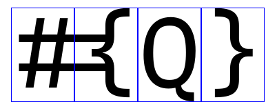
… which clearly produces the wrong output.

Correctly Handling Ligatures
From this experiment we know that the ligature spacer glyph has some information we need to process and since we’re working with a monospace font my best guess is it’s the horizontal advance. So we’ll update our loop to accumulate the advance of all glyphs including #1252…
let mut image = RgbaImage::new();
let mut cursor = 0.0;
for cluster in shape("#{Q}", Ligatures::Enabled) {
    for glyph in cluster.glyphs {
        if glyph.id != 1252 {
            render(cluster, &mut image, cursor);
        }
        cursor += glyph.advance;
    }
}
… which produces the output we’re looking for.

Identifying Ligature Spacers
Now that we have something working, we need to get rid of hardcoding the glyph id. We will always get back false when inspecting if the glyph is a ligature so it’s unclear what we’re meant to do to identify this case.
Actually though, it turns out that there is a more general solution that will handle ligature spacers as well as any other glyph where rasterization should be skipped. To illustrate this, let’s try to rasterize each glyph and inspect the size of the produced image.
for cluster in shape("#{Q}", Ligatures::Enabled) {
    for glyph in cluster.glyphs {
        let image = rasterize(glyph.id);
        println!("id: {}, dim: {}", glyph.id, image.dimensions());
    }
}

// id: 0763, dim: 17x12
// id: 1252, dim: 2x0
// id: 0129, dim: 9x11
// id: 0705, dim: 8x12
Of course, the most interesting output is that glyph #1252 (our ligature spacer) rasterizes to an empty image. What this means is that we don’t need to identify and ignore ligature spacer glyphs specifically but rather any glyph that has an empty rasterization.
What’s Going On
Honestly, I’m not certain.
I’m not an expert with text rendering. I haven’t read the full OpenType spec, nor the Harfbuzz shaping algorithm. I’m not a font creator. And when I searched all over the web to find answers (for ligatures in monospace fonts specifically) I couldn’t find a thing.
However, going off these experimentations I can make an educated guess.
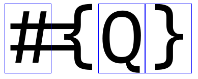
Let’s take a look at the advance width of each non-empty glyph, i.e. skipping our ligature spacer glyph. The min X value of each blue box is the cursor position and the width is the glyph’s horizontal advance width.

Since we are working with a monospace font, every glyph must have the same advance, but the glyph advance is too small for the ligature “#{”. To get around this, it seems the font designers use the ligature spacer glyph which can’t be rendered (with dimensions of 2 x 0 pixels) but will add to the advance of the previous glyph.

Wrapping Up
Having come to this conclusion of how to handle ligature spacer glyphs in monospace fonts, it all seems very logical and straightforward. I was, however, surprised that I didn’t encounter an explanation of this given the number of code editors, text editors, word processors, browsers, terminals, and any other program that needs to shape and render text.
For anyone else undertaking their own text rendering journey, I hope this helps make it a little bit easier. And for those with much more text experience, if you know of any articles that either back up this educated guess, or disprove it, please let me know.